Client: Avon // My Role: Creative and Art Direction
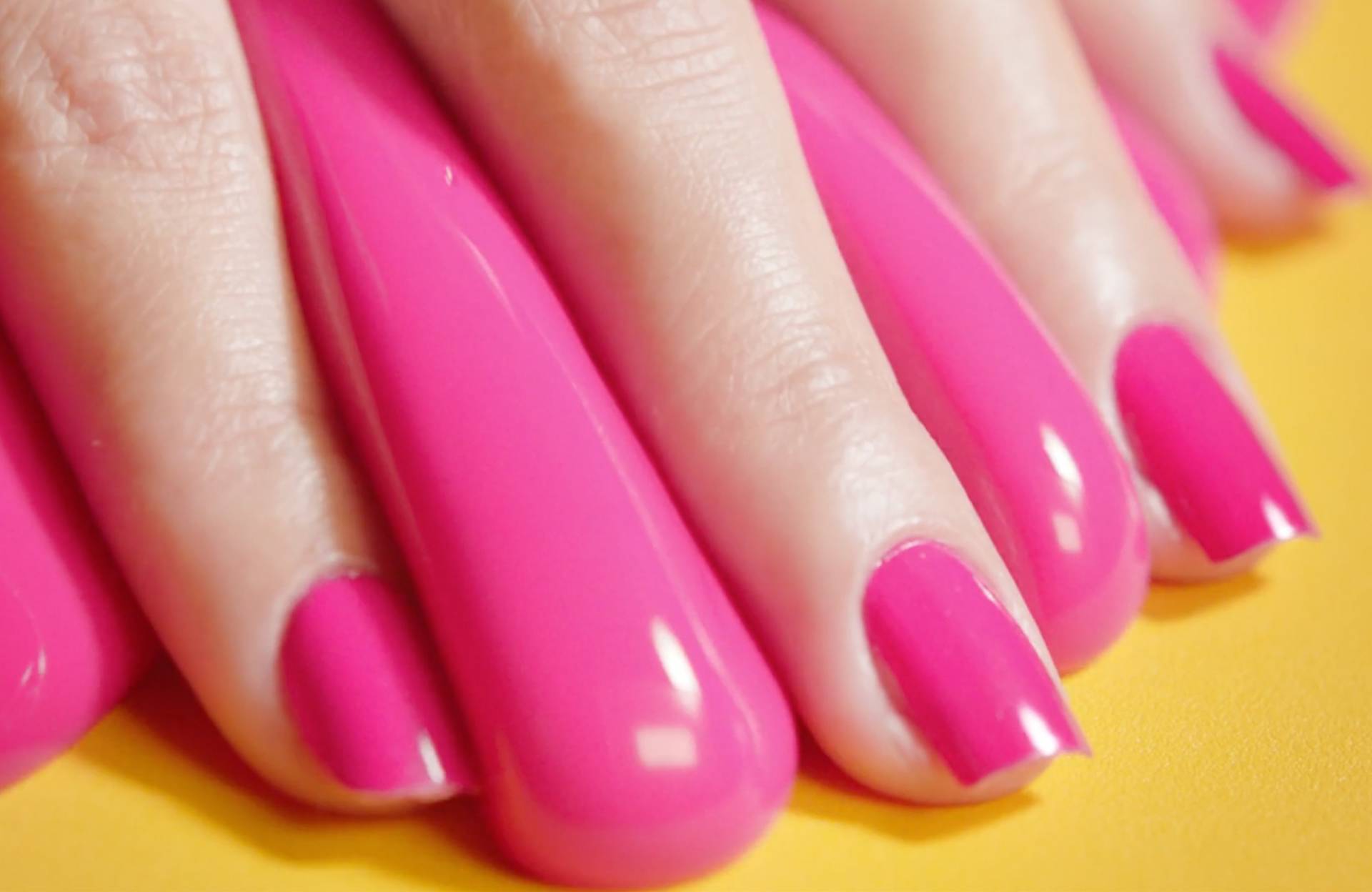
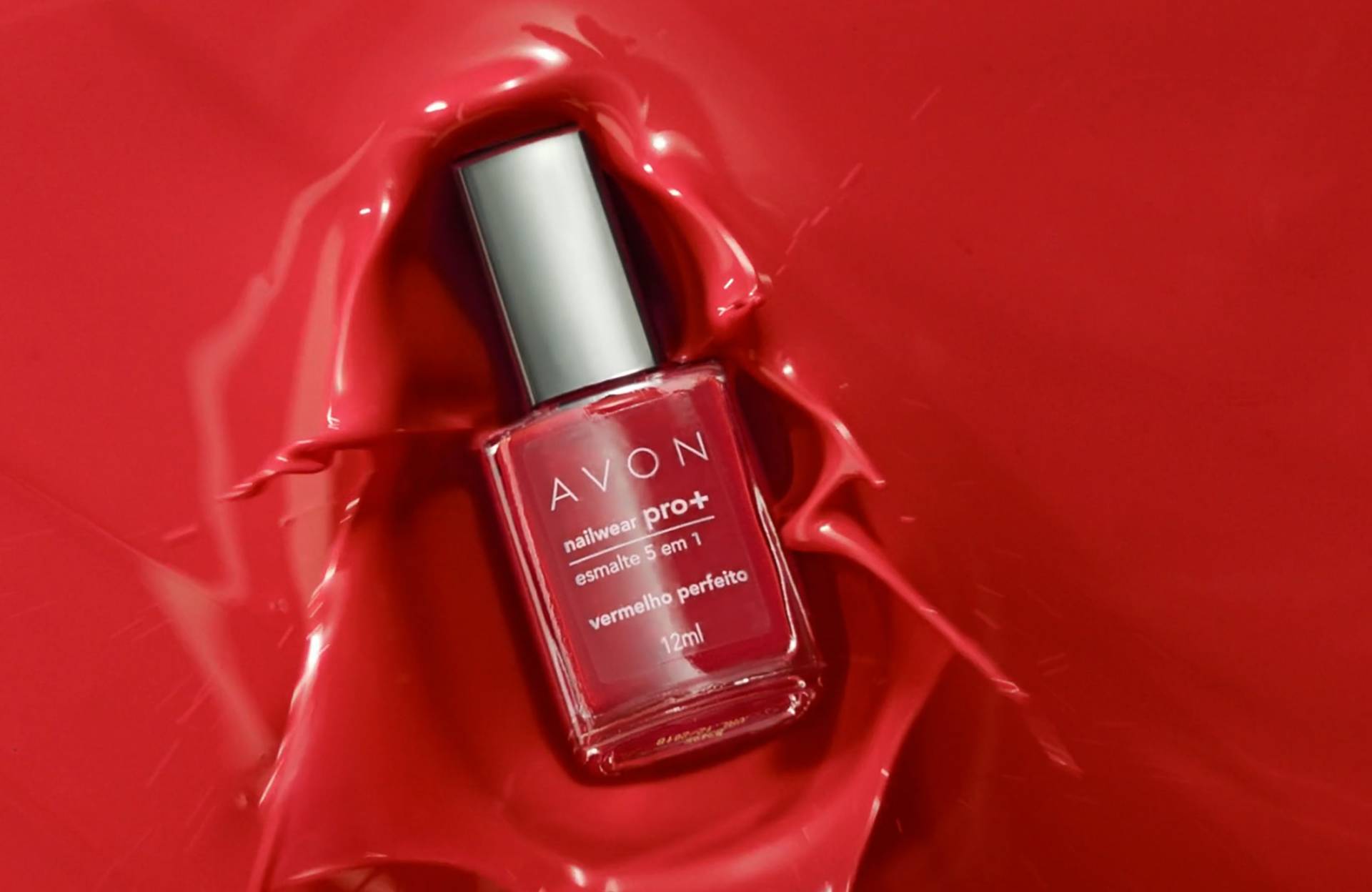
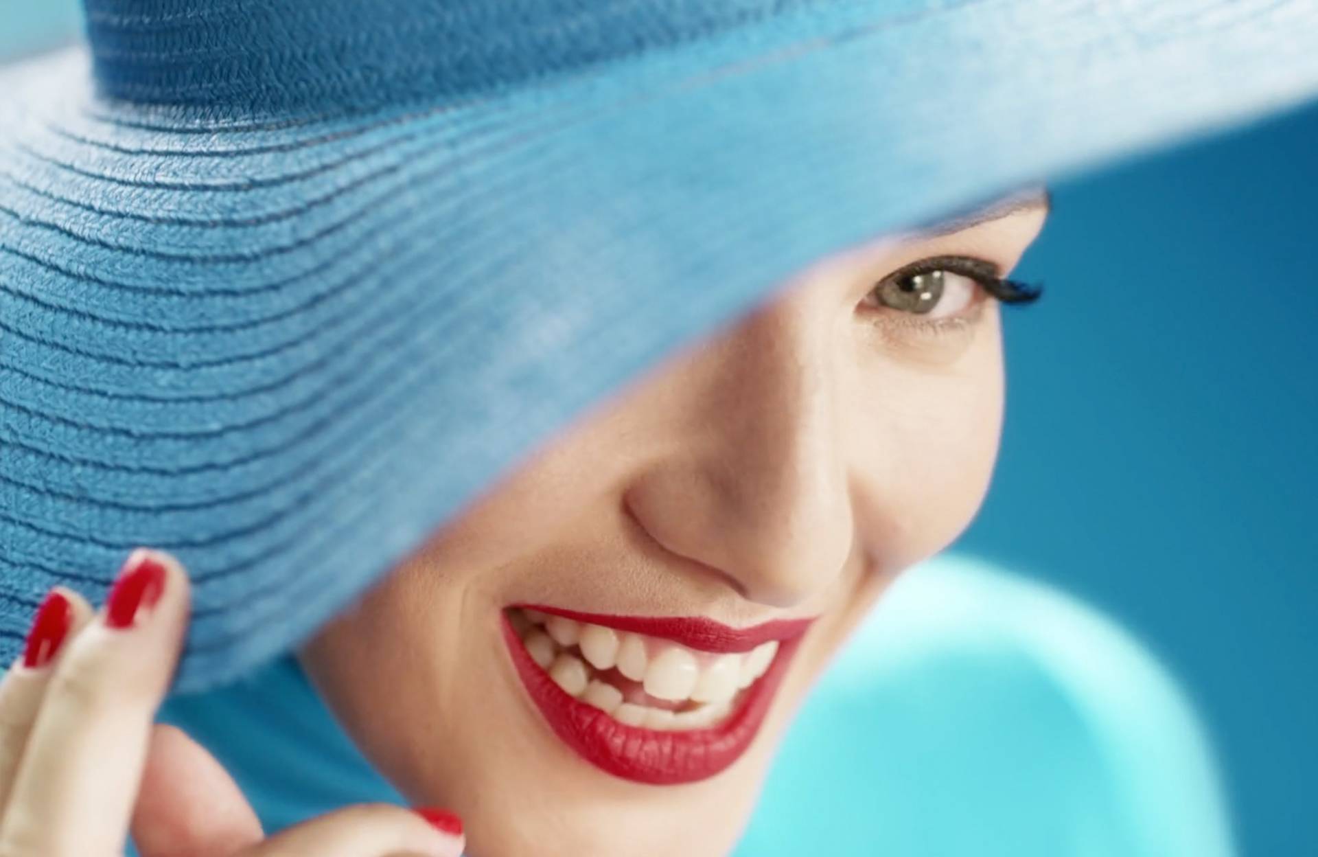
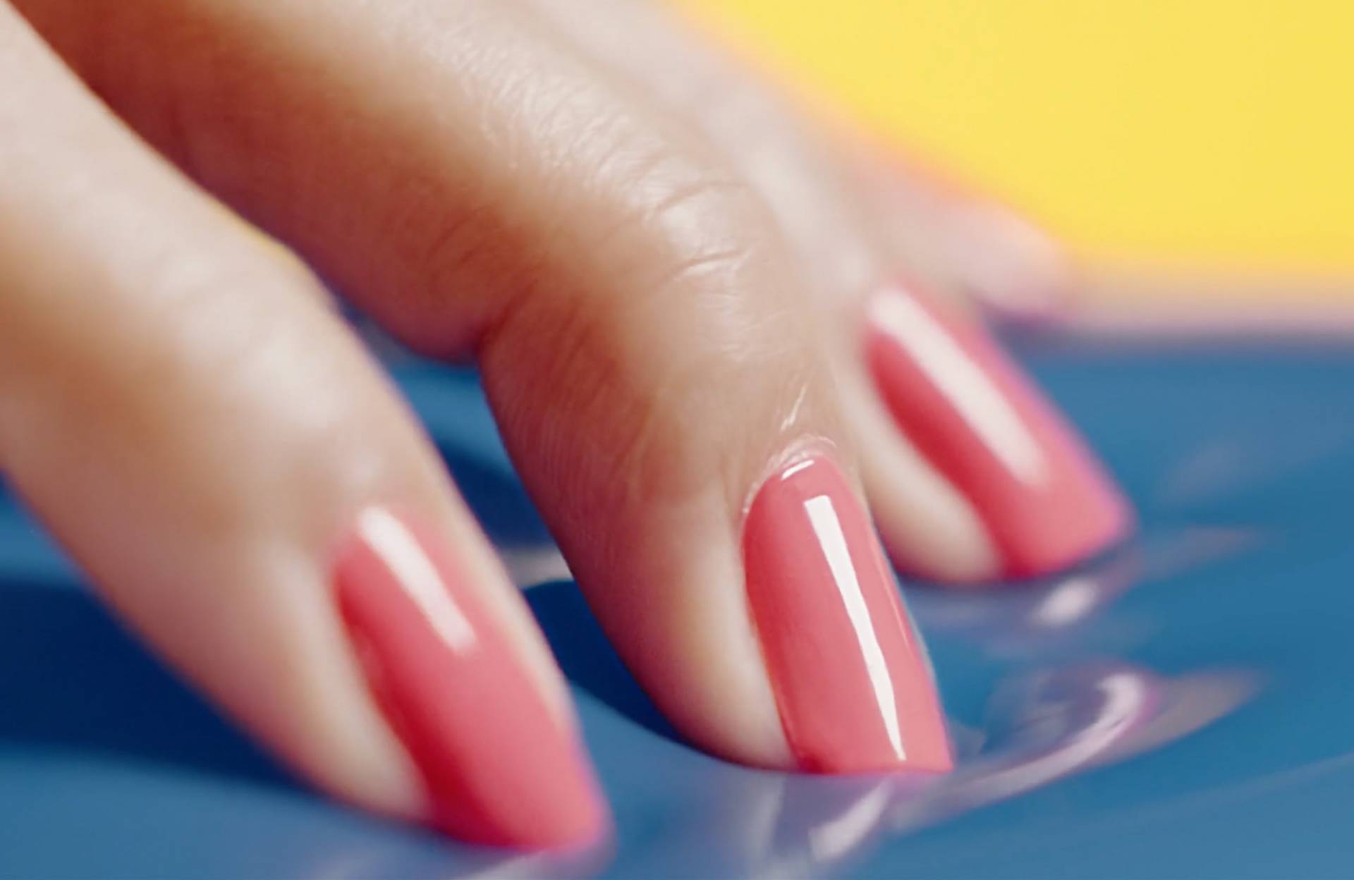
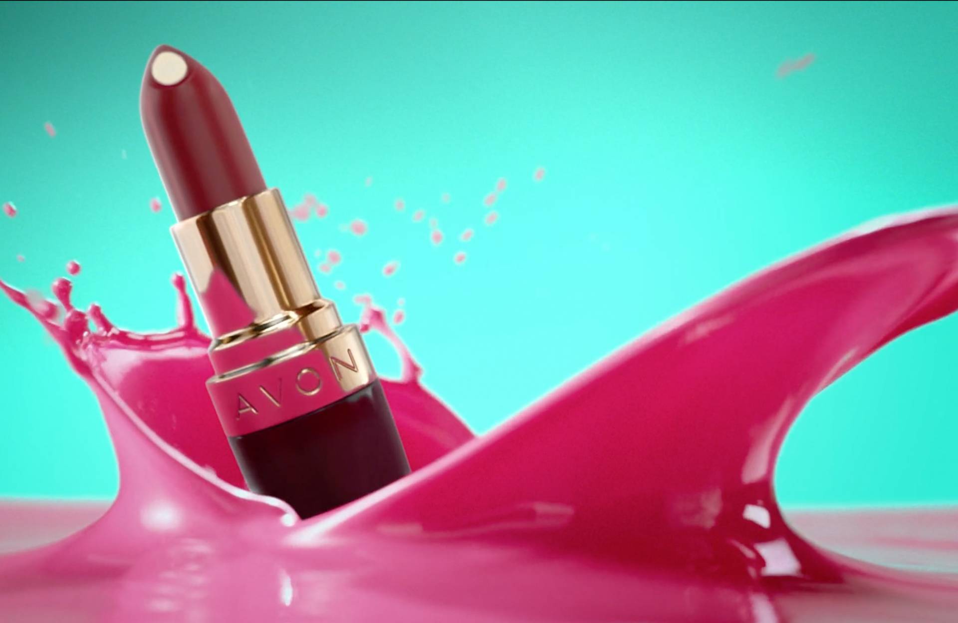
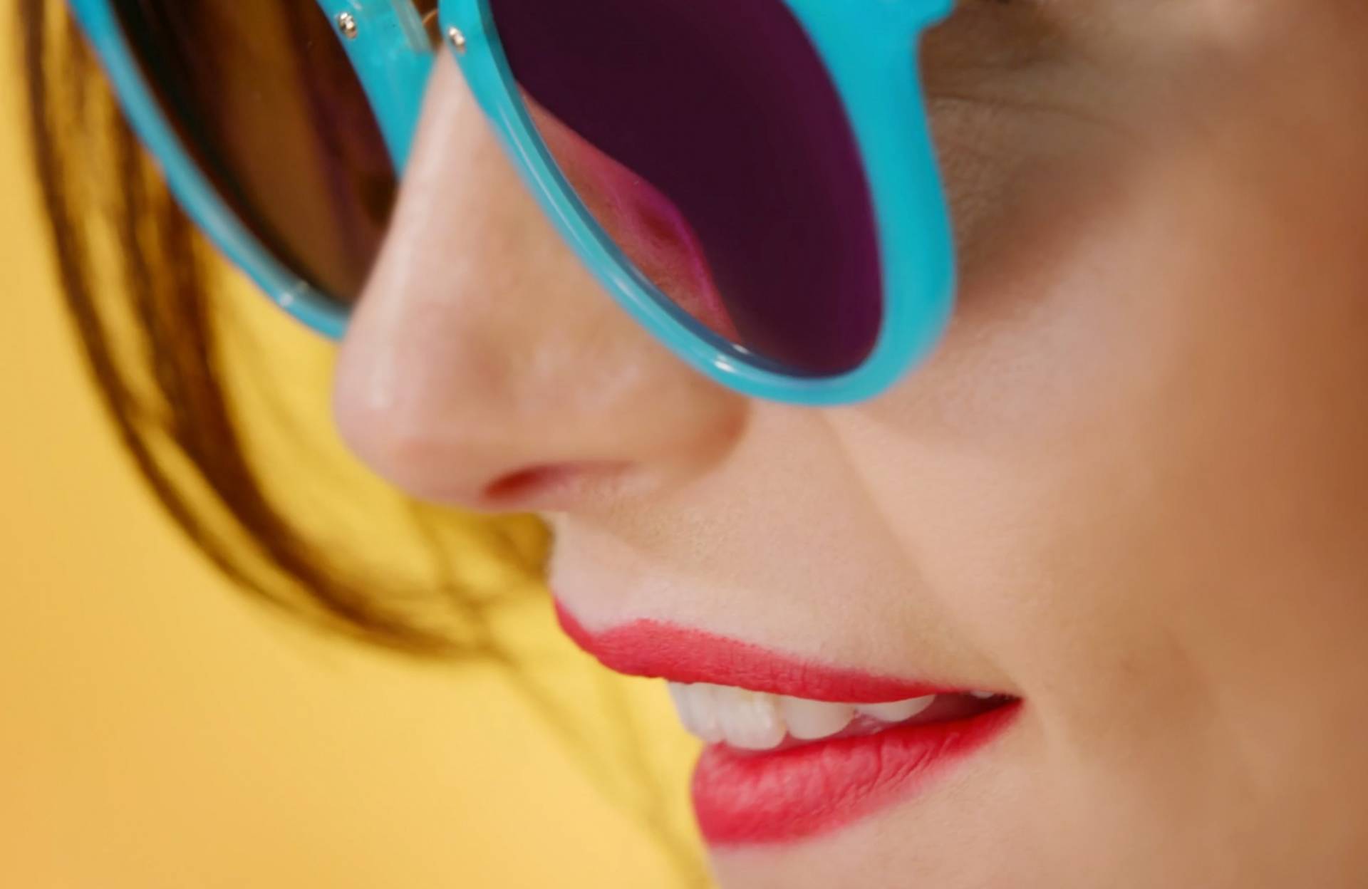
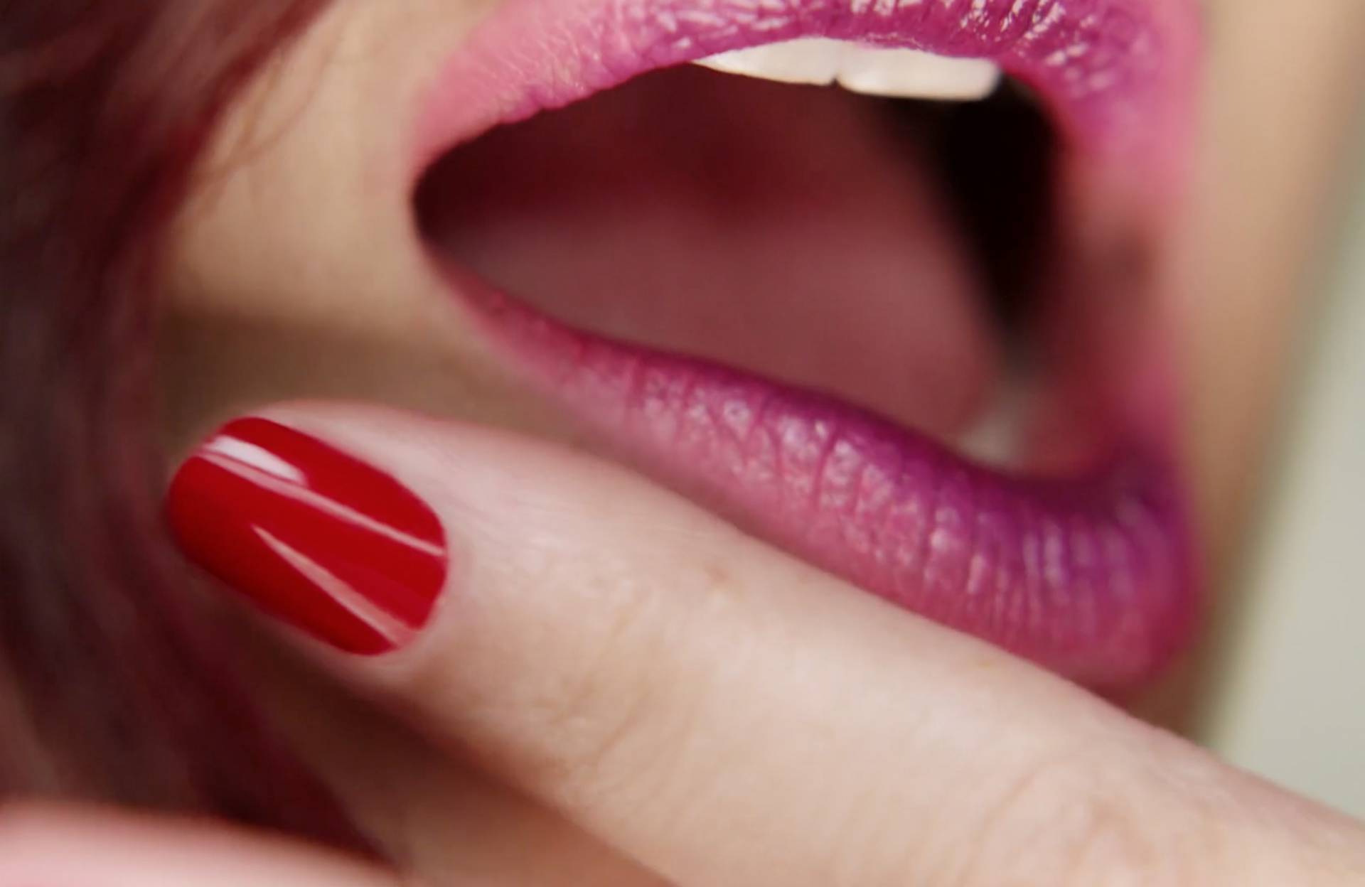
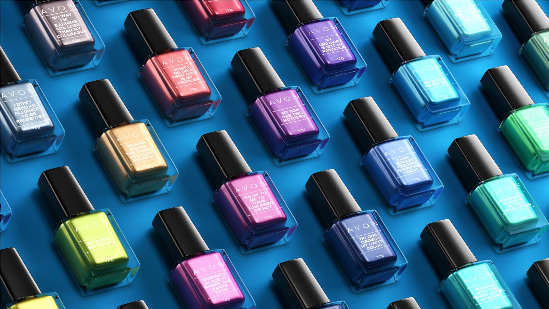
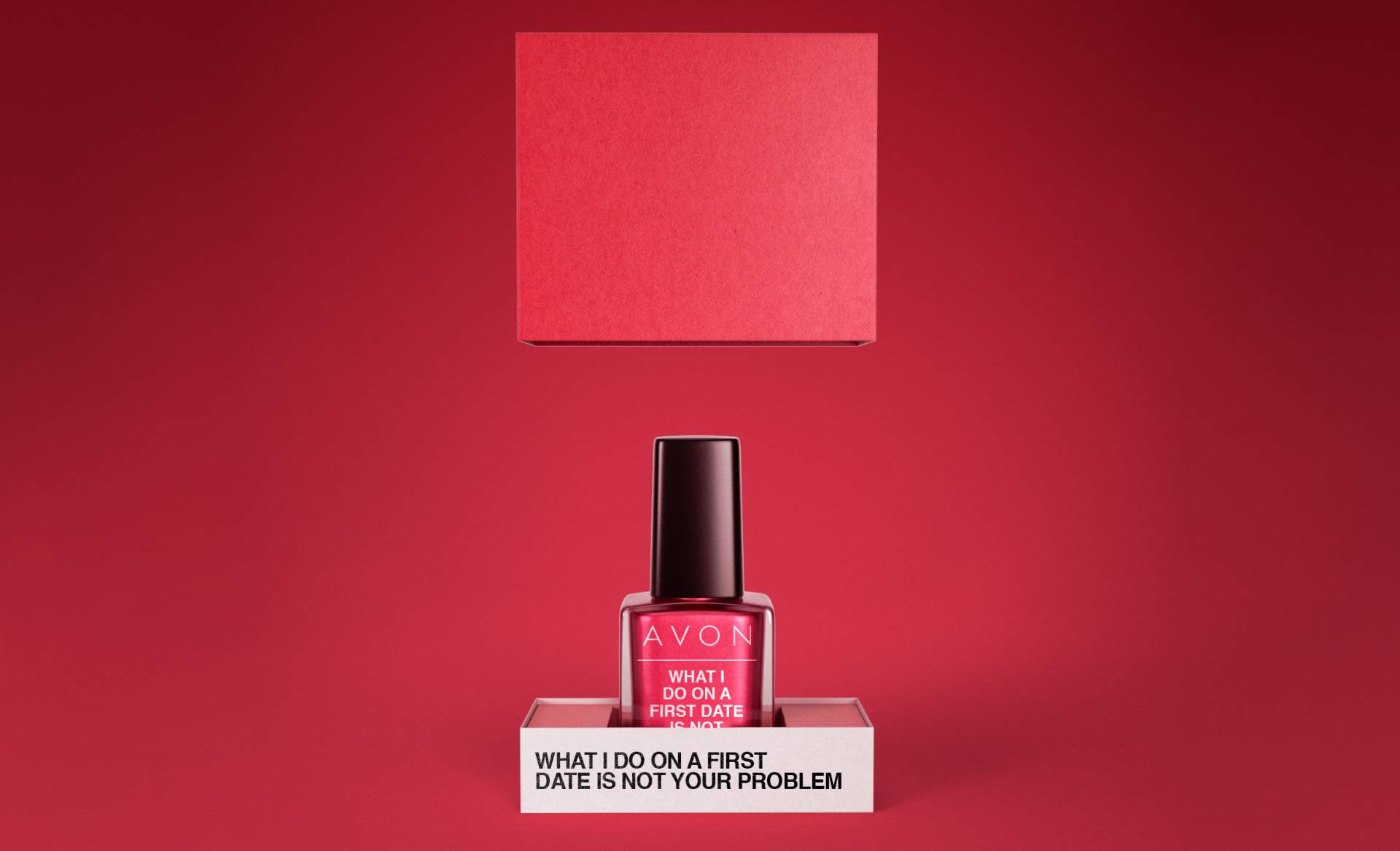
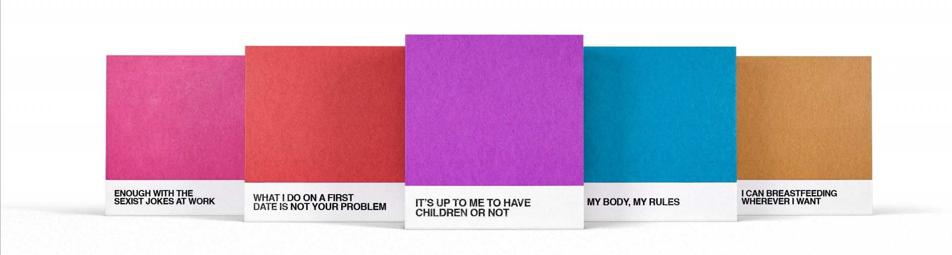
Finally, names of nail polish that have a message to send.
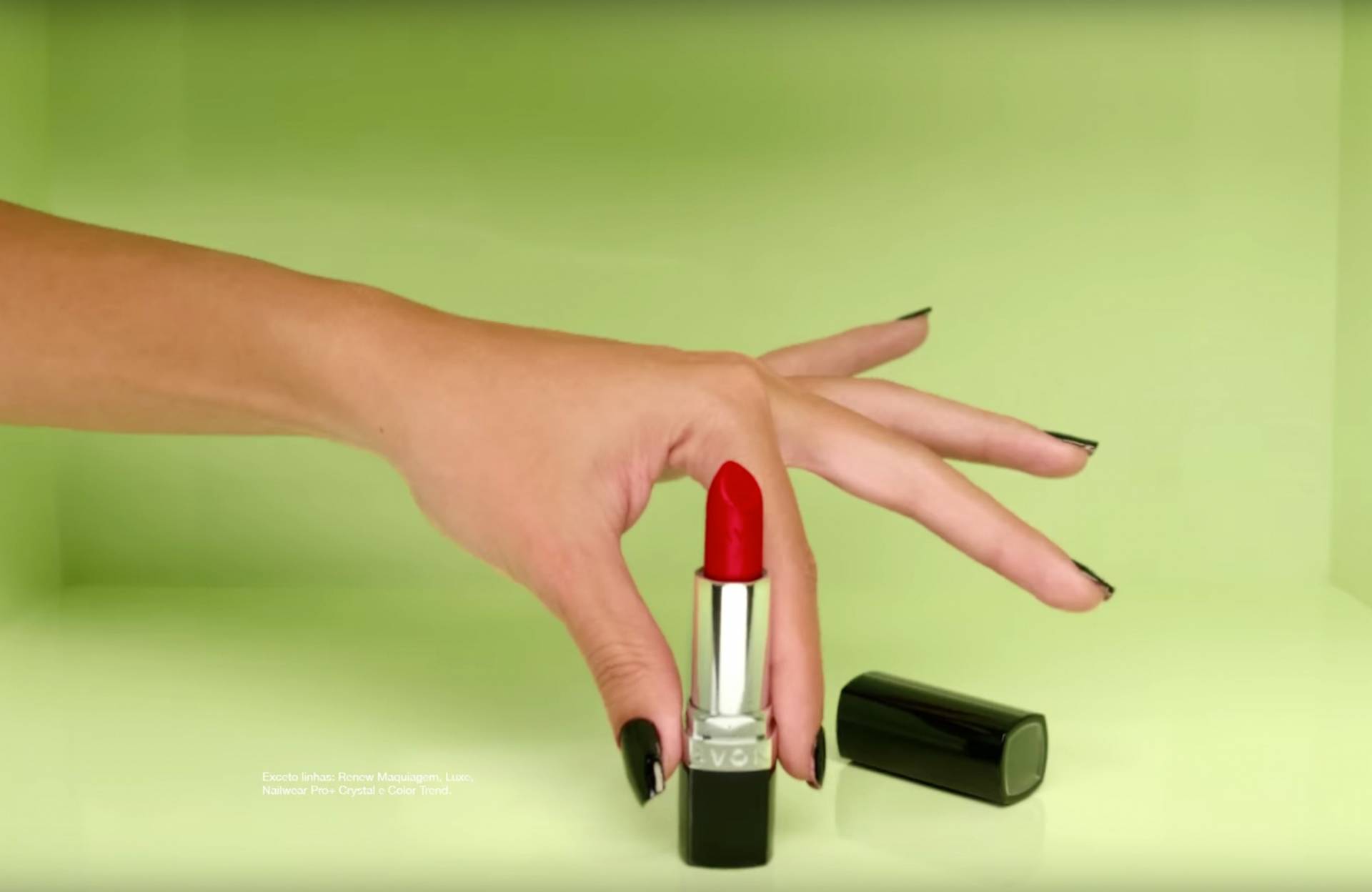
Names of nail polish are always object of caricature, and most of them are going on the wrong direction of female empowerment. That's why we created the colection "Colors That Make Sense", with nail polish names that raise up subjects that are really important for us, women. Influencers were given gifts with personalised boxes, that were also available at the online stores.
Creative Director: Luciana Bueno
Copywriter: Nayara Lima
Art Direction: Paula Bustamante, Paulo Filipe Souza
Head of Art: Humberto Fernandez
CCO: Ricardo John Movie
Producer: Rebolucion
Film Directors: Baby
Work done at WPP Wunderman Thompson Brazil